

Catering to the needs of all your users can be difficult. However, as you design and build software, asking one straightforward question focused on blind screen reader users will help improve the experiences you create for all.
As you continue to ask this question, “accessibility” should become an opportunity for creating great experiences rather than a burden. You’ll learn which patterns to use or avoid, and reduce the anxiety felt should you need to “make things accessible” after the fact.
Okay, so what’s the question? Unashamedly, it’s surprisingly simple: If I couldn’t see the screen, how would I…?
Then, for every element and interaction in your interface, you’d expand on the question with one or more of the following:
- If I couldn’t see the screen, how would I know what this is?
- If I couldn’t see the screen, how would I know what this does?
- If I couldn’t see the screen, how would I know what just happened?
In my experience, we ensure we design and build the right, most usable features by regularly asking these questions.
However, if you can’t answer a question easily or at all, something is amiss with your solution.
If you can’t answer a question in the design phase, you may need to re-think the user experience. If you can’t answer them during development, solutions may come from correctly using semantic HTML, applying necessary ARIA attributes, or managing a user’s focus.
If you still don’t have answers after making changes, your feature may be unfit for purpose and could unnecessarily exclude some users.
On the plus side, needing to redesign or rebuild the feature will often result in a better experience, which is the ultimate goal for our users.
Practising asking the questions
Let’s look at a standard pattern of navigation and wayfinding, and see how we would answer these questions.
Imagine this screenshot of browsing XYZ Corp’s website.

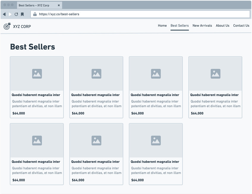
Sighted users can see that they are currently on the Best Sellers page, and it has four additional navigation items. By clicking one of the other links, they would know they have navigated to a new page.
But as a blind screen reader user, how would they be informed of this? Let’s examine the code and explain how it answers the essential questions.
<title>Best Sellers - XYZ Corp</title>

…

<header>
  <a href="/">
    <img src="/images/logo.svg" alt="XYZ Corp" />
  </a>
  <nav aria-labelledby="main-navigation">
    <h2 id="main-navigation">Main navigation</h2>
    <ul>
      <li><a href="/">Home</a></li>
      <li><a aria-current="page" href="/best-sellers">Best Sellers</a></li>
      <li><a href="/new-arrivals">New Arrivals</a></li>
      <li><a href="/about-us">About Us</a></li>
      <li><a href="/contact-us">Contact Us</a></li>
    </ul>
  </nav>
</header>

…

<main aria-labelledby="main-heading" tabindex="-1">
  <h1 id="main-heading">Best Sellers</h1>
</main>
How does this implementation answer the $64,000 question?
We have a <title> element that is essential to providing a concise means of wayfinding. Not only can screen reader users choose to hear the title at any time, but average users also benefit by seeing this in their browser’s tabs UI. Notice how the site/company’s name comes last because it’s less important information as you browse the site. The critical part is the unique page name, which you want to see/hear first.
We also have a matching navigation link, which includes the aria-current="page" attribute. This announces that this link is the current page within the complete set of links, again reinforcing that we’re on Best Sellers.
Our URLs are also indicative of the page’s name. While not all devices and browsers expose them by default, a relevant, meaningful URL is yet another great indicator of where you are.
And finally, we have a single <h1> with matching content that’s associated with the <main> element using the aria-labelledby attribute. So regardless of whether a screen reader user navigated to the <h1> directly or via landmarks to the <main>, they would know that this page is about Best Sellers.
We have now answered the question: If I couldn’t see the screen, would I know what this (page) is?
What about the actual navigation?
The <nav> element describes that the links within it are for navigation. The <ul> and <li> elements will announce that the navigation is a list with a specific number of options, and of course, the <a> lets users know that these are links to another page.
Similar to the <main> element earlier, we add a visually hidden heading and associate that to the <nav> with an aria-labelledby attribute. This lets screen reader users quickly find the main navigation via headings or landmarks.
Here we’ve answered the first and second questions. If you couldn’t see the screen and were using a screen reader, you’d know exactly what the links are and what they do.
That leaves one final question for the navigation: If I couldn’t see the screen, how would I know what just happened?
If you’re building a traditional server or statically-rendered page, using <a> elements will automatically solve this for you. The browser will inform the screen reader to announce a navigation event, put the user’s focus at the root of the next page, and often start reading.
However, you may have additional work to do if the site/app’s navigation requires or is enhanced with client-side JavaScript.
At a minimum, you should add a visually hidden element that announces the route change by hooking into your route change’s success event, similar to:
<div role="alert">
  {routeHasChanged ? `Navigated to ${pageTitle} - XYZ Corp` : ''}
</div>
Because of the role="alert" attribute, a screen reader would immediately broadcast “Navigated to Best Sellers - XYZ Corp”, thus satisfying the question of knowing what just happened.
As with a traditional site, you should move the user’s focus to the first element on the page so they fully understand that a change has occurred, and can start navigating.
If you’re using Next.js, it has a similar feature out of the box, albeit not quite up to my standards for two reasons:
- It doesn’t include the “Navigated to” prefix, thus making it slightly less contextually useful for users; and
- The focus isn’t always set, so a screen reader user may sometimes be left on a phantom element, thus making their Previous and Next commands not behave as expected.
Alternatively, you could improve the experience further by focusing on the <main> element when navigating forward, so users are instantly taken to the new page’s content. When navigating back, automatically focusing on the element that caused the original route change would allow users to continue from where they left off.
Unfortunately, while I have previously implemented this behaviour in a custom Vue.js application, I haven’t found a similar drop-in solution for common React-based frameworks.
Hopefully, you can appreciate how much thinking goes into making a ubiquitous, seemingly simple pattern accessible to screen reader users and improving the UX for all users.
Questioning another pattern
With this awareness, imagine you continue developing XYZ Corp’s online store. You’re asked to implement a set of two icon buttons that change the search results to display as either a grid or list view, with grid selected by default. This pattern should be obvious for sighted users, but what other things should you consider?

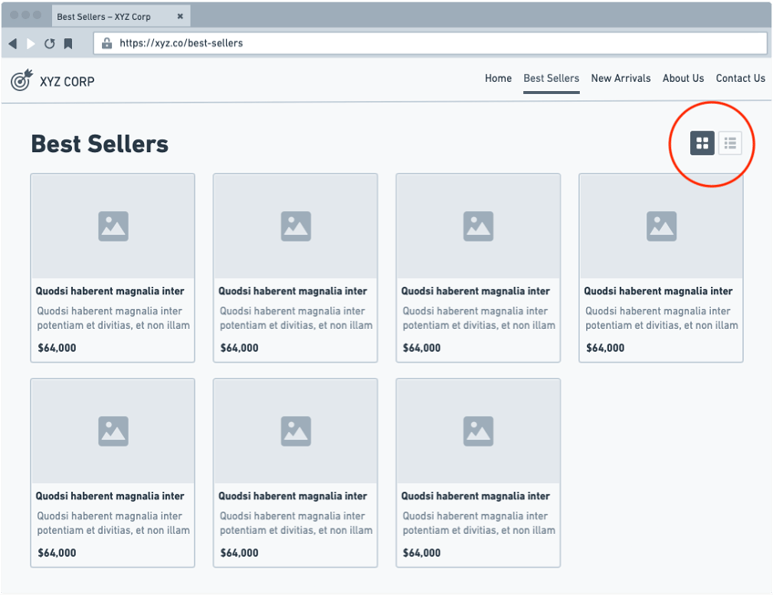
You, of course, need to ask the $64,000 question.
In this context, you may take the questions and reframe them as: If I couldn’t see the screen:
- How would I know what the buttons do?
- How would I know when one is pressed?
- How would I know that the results view has changed?
Happily, this pattern requires minimal effort:
<button
  aria-controls="results-view"
  aria-label="Display as grid view"
  aria-pressed="true"
  onClick="handleToggleResultsView"
>
  <svg aria-hidden="true" focusable="false" role="img">…</svg>
</button>

<button
  aria-controls="results-view"
  aria-label="Display as list view"
  aria-pressed="false"
  onClick="handleToggleResultsView"
>
  <svg aria-hidden="true" focusable="false" role="img">…</svg>
</button>

<div id="”results-view”">… list of results…</div>
By providing <button> elements whose aria-pressed attributes change appropriately in handleToggleResultsView, we create accessible toggle buttons that automatically indicate which is pressed. Of course, sighted users need to be made aware which is pressed by changing its appearance, and not just its colour.
The buttons use aria-label as a descriptive label for screen readers, and various attributes on the SVG to ensure they’re not accidentally reachable by screen readers and keyboard users of various devices and browsers.
The buttons also have an aria-controls attribute which points to the id of the element containing the results. While this attribute isn’t supported in all screen readers, it’s still worthwhile creating this explicit relationship between elements.
We’ve successfully answered the $64,000 question! A user will know what the buttons are, what they do and what happens when you press them.
Conclusion
Hopefully, I’ve demonstrated that by thinking about software in terms of how its elements and actions are conveyed, and not just by how it looks, you can create accessible and usable experiences for a much wider range of your user base.
Luckily, you don’t have to work out accessible solutions for many standard patterns, as there are well-tested and documented approaches in the ARIA Authoring Practices Guide and elsewhere.
However, sometimes the things you work on don’t have an agreed-upon, accessible solution. In these cases, ask yourself one question: If I couldn’t see the screen, how would I…?