



As part of a six-month engagement, we helped a fast-growing global technology unicorn prepare their design system for an upcoming rebrand.
The design system had supported years of growth (and was used in more than 50 micro-frontends), but its theming architecture had become complex and difficult to extend. With so many applications depending on it, a rewrite would have shifted too much of the migration burden onto the frontend teams maintaining them. We needed a way to modernise the system while giving consumers the option to migrate ahead of the next major release.
The compatibility problem
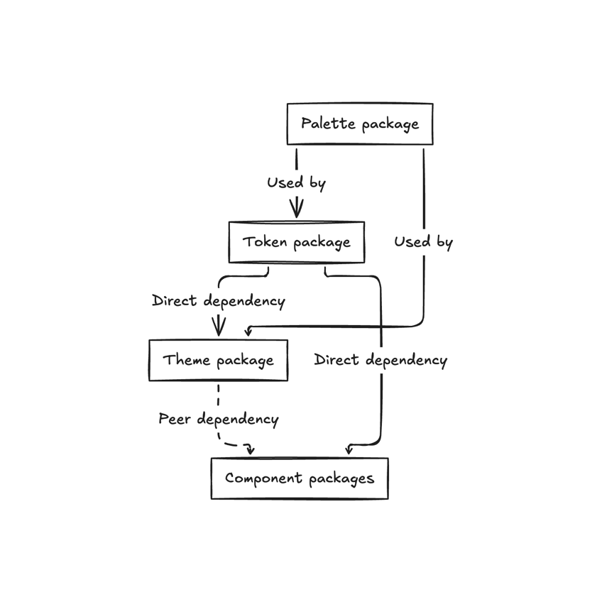
The design system’s component packages and theme package were versioned independently. Each component package declared the theme as a peer dependency, so introducing new tokens meant changing both packages: the theme needed to provide them, and the components needed to consume them.
Under the project’s versioning policy, increasing the minimum supported theme peer dependency was considered a breaking change. Consumers could upgrade components and the theme independently, so we needed to support all four combinations:
| Old component | New component | |
|---|---|---|
| Old theme | Existing behaviour | Must handle missing new tokens |
| New theme | Legacy behaviour remains available | New token mappings available when opted in |
A newer component couldn’t assume the installed theme contained its new tokens, while an older component still needed to work with a newer theme.
We couldn’t just replace the existing API or force consumers to upgrade everything together. The old and new systems needed to coexist until we could make a breaking change.
Designing a migration path with AI
The compatibility problem raised a more specific question: where should the new token definitions live? A newer component could carry those definitions, but the installed theme might not supply values for every new token. Keeping the definitions only in the theme would make the component rely on an upgrade we could not require without a breaking change.
We used AI agents to investigate the package relationships and how components worked with older themes. The agents mapped the existing behaviour and explored alternatives. We decided where the new definitions should live and which dependencies the packages should take on.
We chose a small, independent token definitions package that depended only on the palette package. It did not depend on the theme, React or Emotion. The theme could use it to build the new token tree, while migrated components could carry a compatible token package as a regular dependency and keep their existing theme peer dependency. A component would therefore have access to the definitions it needed without forcing an application to upgrade its theme at the same time. That did not make an older theme provide new values; the component still needed to fall back to its legacy values when those tokens were missing.

Untangling the theme API
The theme API had become difficult to maintain. Its naming and structure had grown inconsistent over time, and many component styles were hard-coded or couldn’t be customised through the theme.
We namespaced the new token structure under theme.tokens alongside the existing top-level API, allowing us to reorganise the tokens without forcing consumers to migrate immediately.
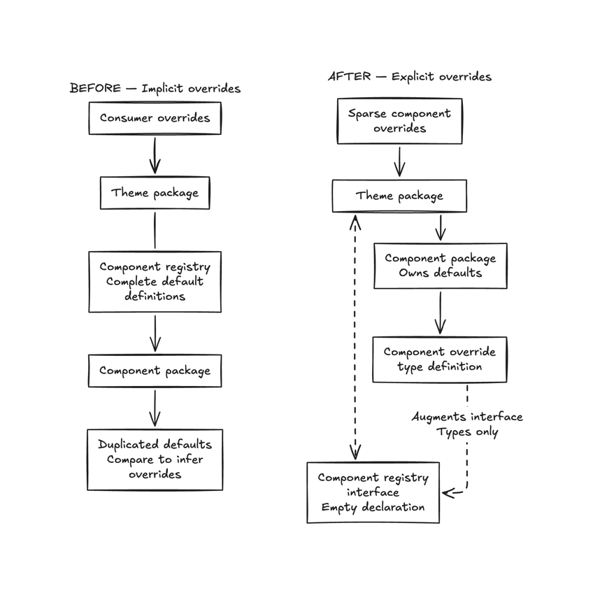
Component overrides were a little trickier. The theme package contained complete default definitions for each component, with those defaults duplicated in component compatibility code. To determine whether a consumer had overridden a value, we had to compare the resolved theme against a baseline. Differences could also come from mismatched package versions, making the comparison unreliable.
We wanted components to own their defaults and let consumers provide sparse overrides containing only the values they wanted to change. But the theme package still needed to expose types for those overrides, and it couldn’t depend on the component packages without creating circular dependencies.
TypeScript’s module augmentation gave us an elegant solution. The theme package declared an empty interface for component overrides, and each component package extended it with its own override types. TypeScript merged those declarations, giving consumers a single typed API without the theme package needing to know about individual components.
This gave migrated components a single source of truth for their defaults, without needing to compare complete theme definitions to identify overrides. It also let components evolve their override types independently, without coordinating releases of the theme package.

Introducing the new system in minor releases
We began shipping the new theming architecture in backwards-compatible minor releases, with an opt-in future flag so consumers could try the new behaviour ahead of the major release.
When we used AI to spike a component migration, it produced sprawling conditional logic to support both old and new theme values. The result was difficult to review. Left to its own devices, an agent probably would have happily repeated that approach throughout the codebase without questioning it.
Without a mapper, even a simplified component change could look like this:
9 lines
borderColor: isReadOnly
  ? theme.future?.v2_tokens
    ? theme.tokens?.colors?.border?.emphasis
      ?? legacyDecorativeBorder
    : legacyDecorativeBorder
  : theme.future?.v2_tokens
    ? theme.tokens?.colors?.border?.selected
      ?? legacyInteractiveBorder
    : legacyInteractiveBorder
This is where human judgement made the difference. Rather than accept hundreds of difficult-to-review changes, we proposed an abstraction and iterated on it with AI until we had an API we were happy with: createTokenMapper.
It was a factory function that accepted the future flag and a getter for the new tokens, and it returned a mapping function. Each mapping paired a callback reading the new token with a legacy fallback. The mapper returned the legacy value when the flag was disabled, when new tokens were absent or when a newer component requested a token that the installed theme version did not define, even with the flag enabled. It lived in the token package shown above so both the theme and components could use it without introducing a circular dependency.
We set up the mapper and used it like this:
const mapToken = createTokenMapper(
  theme.future?.v2_tokens,
  () => theme.tokens,
);

const background = mapToken(
  (t) => t.colors.bg.fill.brand,
  legacyBackground,
);
With the mapper, the same component change looked roughly like this:
3 lines
borderColor: isReadOnly
  ? mapToken((t) => t.colors.border.emphasis, legacyDecorativeBorder)
  : mapToken((t) => t.colors.border.selected, legacyInteractiveBorder)
Applying the pattern to components
Once we were satisfied with the abstraction, we applied it across components. AI agents could follow the same pattern instead of inventing compatibility handling for every token, and developers could review each new token and its legacy fallback together at the call site.
The client’s investment in AI-assisted engineering included an internal platform that handled much of the repetitive migration work. We’d give an agent a ticket, and it would implement the change and open a merge request. We’d then tag a separate AI review agent in Slack, which often caught issues that were easy to miss in large diffs.
That made human code review more manageable, freeing us to focus on visual and behavioural correctness while automated tests and CI provided additional checks.
We created dedicated Storybook stories showing the same components and states with the future flag enabled and disabled. Designers and developers used them to check the changes we intended and catch the ones we didn’t.
Alongside snapshot tests and occasional local visual regression tests, these comparisons gave us confidence in the components themselves. But they couldn’t tell us how applications accessing theme values directly would behave.
Testing with a dark theme
The design system’s default theme was light. We created an approximate dark theme using the new token structure, with the future flag enabled.
Hard-coded colours and styles that didn’t respond to the theme became much easier to spot against a dark background. It was a quick way to find UI that was off-system.
We tested the dark theme in “kitchen-sink” stories. To test the consuming micro-frontends, we also extended an existing Chrome extension that could load feature-branch builds into staging applications. This let us test the new theming system without a production rollout.
As the work went on, the staging applications looked progressively better under the dark theme. Some improvements came from changes to the design system, and others came from the teams maintaining the consuming applications.
Helping consumers migrate
We also built a separate adapter package that mapped supported legacy override keys to their new token keys, giving consumers a temporary bridge while updating their configuration:
// Before
<ThemeProvider themeOverride={overrides}>
  <App />
</ThemeProvider>

// After
<ThemeProvider themeOverride={legacyAdapter(overrides)}>
  <App />
</ThemeProvider>
Keeping the adapter separate from the core theme meant consumers could use it during migration without making legacy conversion a permanent part of the new architecture.
What remains for the major release
By the time we rolled off, we’d completed the non-breaking implementation work needed to introduce the new theming architecture. The breaking release was still ahead, but it had been planned in detail, and we ran a handover session for the team and recorded it.
Because we’d done the groundwork in minor releases, the remaining breaking changes were largely about removing compatibility code rather than introducing a new architecture.
I don’t think a team our size could have investigated a design system of roughly 100 components, migrated the components in scope and reviewed the results in six months without AI.
Without it, we’d probably have pushed for a rewrite. That would have been substantial work for our team, but it might have been easier to reason about and given us greater confidence without so much legacy behaviour to preserve. It also would have shifted much more migration work onto frontend teams, who would have had to adopt changed components and APIs.
AI made the incremental approach practical: agents helped us understand existing implementations and apply patterns we had decided on across components. We still had to judge which patterns were safe to repeat, how to review each migration and how to leave compatibility code easy to remove.